Features: Basic Input
Element Names and Descriptions
Most items can have a display name and a description which can be both specified via attributes:
- @System.ComponentModel.DisplayNameAttribute
- @System.ComponentModel.DescriptionAttribute
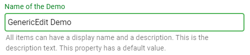
[DisplayName("Name of the Demo")]
[Description("Most items can have a display name and a description. This is the description text.")]
public string DemoName { get; set; } = "GenericEdit Demo";
See also: Localization
Automatic Display Name
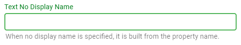
When no DisplayName atttribute is specified, a displayname will be generated from the property name by spliting the property name from capitalization.
public string TextNoDisplayName { get; set; }
Hiding the Display Name
To not show a display name, provide an empty string:
[DisplayName("")]
[Description("This property has an empty display name.")]
public string TextWithEmptyDisplayName { get; set; }

Text Input
Basic Text
A string property will cause a simple text input to be generated.
[DisplayName("Name of the Demo")]
public string DemoName { get; set; }

Password
Adding the IsPasswordAttribute to a string property will create a password input:
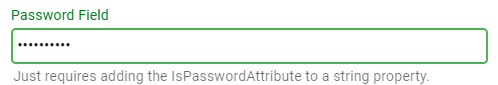
[DisplayName("Password Field")]
[Description("Just requires adding the IsPasswordAttribute to a string property.")]
[IsPassword]
public string PasswordValue { get; set; }
Warning
For security reasons, please avoid round-tripping passwords to the clients! Passwords should be replaced with something generic before transmitting the data to clients!
Multi-Line Text
Apply the EditMultilineAttribute to create multi-line text input:
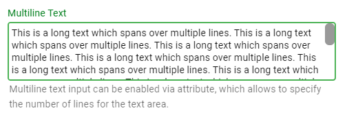
[DisplayName("Multiline Text")]
[Description("Multiline text input can be enabled via attribute, which allows to specify the number of lines for the text area.")]
[EditMultiline(4)]
public string MultilineText { get; set; }
Number Input
Integer
[DisplayName("Integer Value")]
[Description("This is a normal int32 value. It is not possible to submit an empty value")]
[Required]
public int IntValue { get; set; } = 100;

Nullable Integer
[DisplayName("Nullable Integer Value")]
[Description("The value can be deleted and submitted empty")]
public int? IntValue2 { get; set; } = 100;

Double
[DisplayName("Double Value")]
[Description("Float and double values are shown with 6 digits by default")]
public double DoubleValue { get; set; } = 3.141592;

Double with 2 Decimals
With the DecimalsAttribute it is possible to control the number of decimals to display:
[DisplayName("Double Value with 2 Decimals")]
[Decimals(2)]
[Description("The number of decimals can be controlled through the DecimalsAttribute.")]
public double DoubleValue2 { get; set; } = 3.1;

Boolean Input
Boolean Value
Boolean properties are rendered as checkboxes:
[DisplayName("Boolean Value")]
[Description("Boolean properties are rendered as checkboxes.")]
public bool BooleanValue { get; set; } = true;

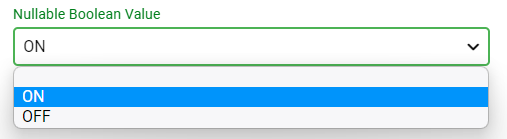
Nullable Boolean Value
Nullable boolean properties are rendered as dropdowns including an empty item:
[DisplayName("Nullable Boolean Value")]
[Description("Nullable boolean properties are rendered as dropdowns.")]
public bool? NullableBooleanValue { get; set; } = true;
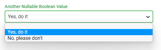
Nullable Boolean with Custom Text
For nullable boolean properties, it is possible to control the display texts via attributes
[DisplayName("Another Nullable Boolean Value")]
[Description("For nullable boolean properties, it is possible to control the display texts via attributes")]
[TristateTrueText("Yes, do it"), TristateFalseText("No, please don't")]
public bool? NullableBooleanValue2 { get; set; } = true;
Date and Time Input
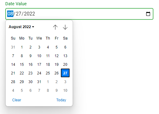
Date Value
[DisplayName("Date Value")]
public DateTime DateValue { get; set; } = DateTime.Now;
Note
Support for input of time values or date+time values is planned to be added
File and Folder Picking
File Picker
Add the EditFilePickerAttribute attribute to a string property to create a text box with file picker functionality.
[DisplayName("File Picker")]
[Description("Just add the EditFilePicker attribute to a string property.")]
[EditFilePicker]
public string FileValue { get; set; }

Folder Picker
Add the EditFolderPickerAttribute attribute to a string property to create a text box with file picker functionality.
[DisplayName("Folder Picker")]
[Description("Just add the EditFolderPicker attribute to a string property.")]
[EditFolderPicker]
public string FolderValue { get; set; }